This site
2026A deliberately small portfolio: no framework theatre, no megabytes of decoration.
Problem
The previous version of this site shipped 8.7 MB of decorative background images and six overlapping animation libraries to render three pages of text. It looked busy and loaded slowly, which is the opposite of what a portfolio should demonstrate.
Approach
Rebuilt on the Next.js App Router with Tailwind v4 and no animation library at all — the motion here is CSS transitions with custom easing curves, which run off the main thread and stay smooth. The atmosphere the old site bought with megabytes of JPEGs is now a four-kilobyte inline SVG. Dark mode resolves before first paint, so there is no flash.
Result
Static HTML on every route, a fraction of the previous JavaScript, and motion that respects prefers-reduced-motion throughout. Every change was checked against the rendered page before it shipped — horizontal overflow measured at six widths, scroll reveals checked for content left stranded part-faded, the page transition timed end to end — which is how three defects that read fine in the diff got caught. The README documents the decisions that are load-bearing and silently breakable, because the cost of a change is set by whether the next person can see the trap.
Walkthrough

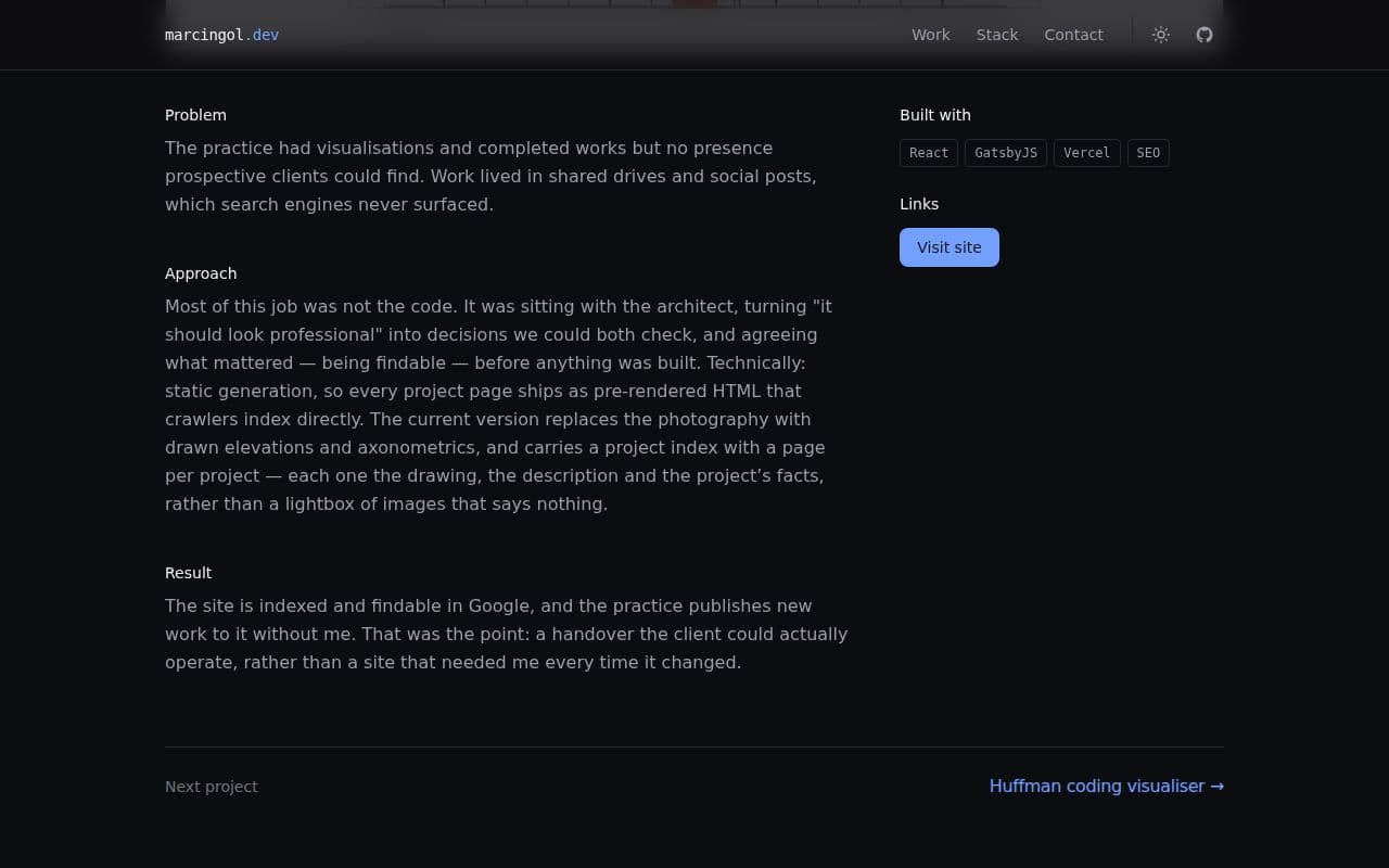
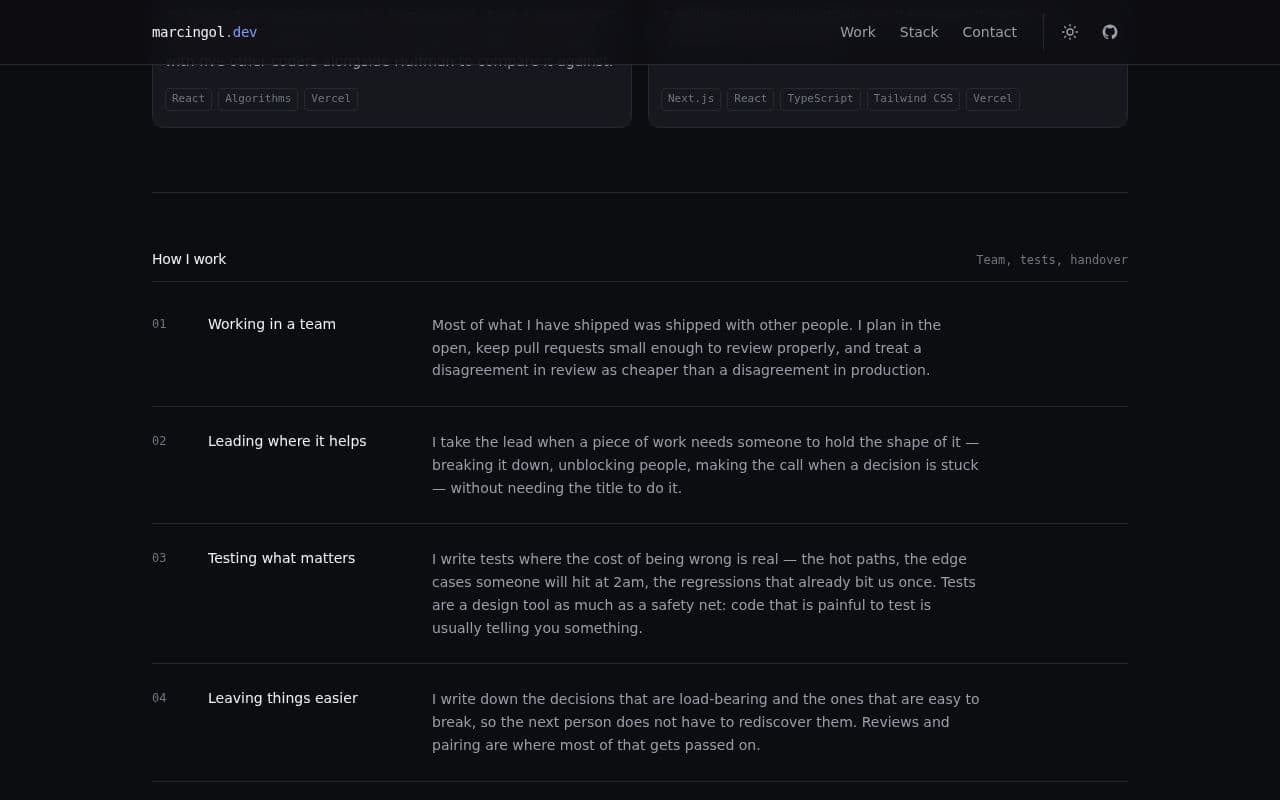
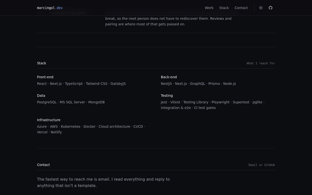
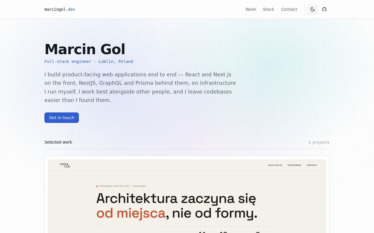
Before / after

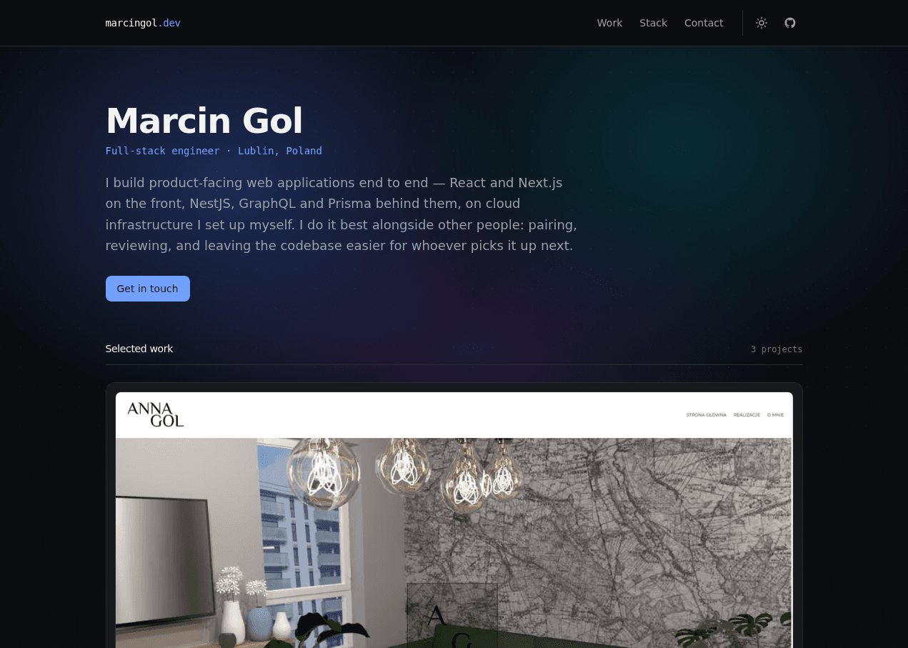
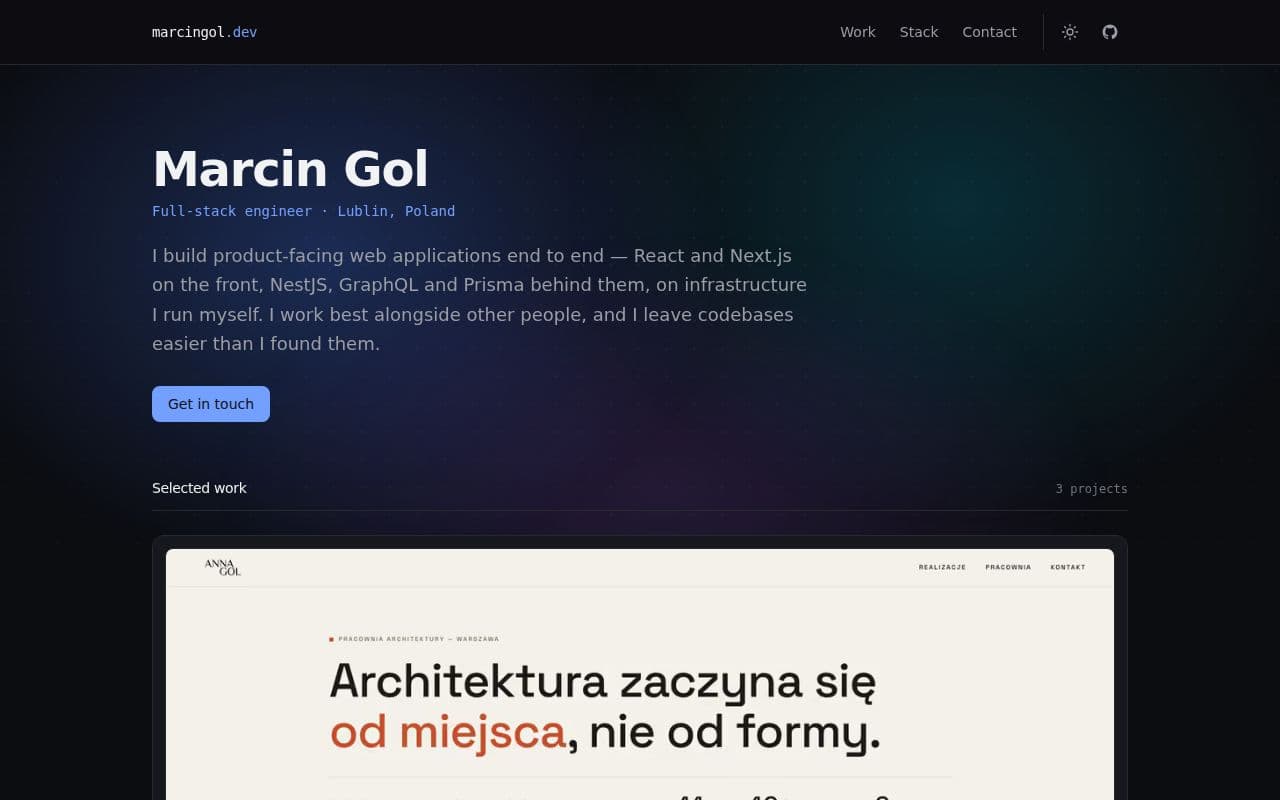
Both screenshots are the homepage at 1271×907, captured the same way, so the difference is the design rather than the framing.